

You find a sweater in a color called sage and immediately think it should be perfect. Or maybe you reach for a classic camel coat because every capsule wardrobe seems to include one, choose a crisp white shirt because it is supposed to be a timeless basic, or buy a pale blue blouse because Summer seasons are often associated with pastels.

Free Soft Summer Resource
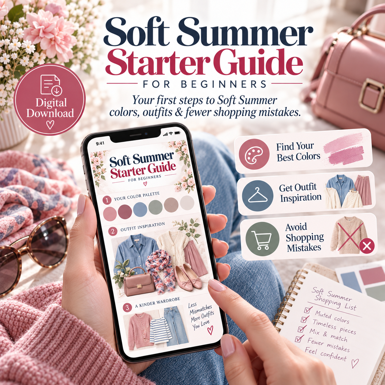
Your Soft Summer Shopping Guide
Keep your best colors, outfit combinations and beauty inspiration handy on your phone.
Get the Free Guide →Then you try everything on and, somehow, the outfit still does not feel quite right.
This is one of the most frustrating parts of seasonal color analysis. Knowing that you are a Soft Summer is one thing, but actually recognizing the right clothes while shopping is a completely different skill. Stores do not organize their collections by “muted, cool-neutral and medium contrast.” They organize them by trend, season and whatever color name a brand happens to choose.
That is why this guide is not simply about colors you should or should not wear. Instead, I want to show you the most common Soft Summer shopping mistakes, explain why they happen and give you practical alternatives that make shopping much easier.
If you are still unsure whether Soft Summer is actually your season, start with my Soft Summer Color Analysis guide first.
Before We Start: A Note About Product Examples
Throughout this article, I have included a few real shopping examples so you can see what I mean when I talk about dusty blue, cool taupe, softer gray or muted navy.
As an Amazon Associate I earn from qualifying purchases.
Please keep in mind that product colors can vary depending on your screen, lighting, product photography and even the dye lot of a garment. I therefore use these products as practical starting points rather than as a guarantee that every item will look exactly the same in person.
Mistake #1: Shopping by the Color Name
One of the easiest Soft Summer mistakes to make is trusting the color name too much.
A sweater called “sage” might be a beautiful soft gray-green, but it could just as easily lean yellow, olive or khaki. The same is true for mauve, taupe, dusty rose or mushroom. These names are not standardized, and different brands use them for completely different shades.
That means the name of the color should never be the reason you buy something.
Instead, try to look at the garment before you even focus on the label. Does the color appear softened rather than bright? Is there a smoky or slightly gray quality to it? Does it feel cool or cool-neutral rather than golden or orange? And most importantly, would it sit naturally beside the other colors in your Soft Summer wardrobe?
This approach is especially helpful when shopping online, where a product name can easily convince you that an item is right even though the actual photograph tells a different story.
Mistake #2: Thinking “Cool” Automatically Means Soft Summer
Soft Summer is a cool-neutral season, but coolness alone does not make a color Soft Summer.
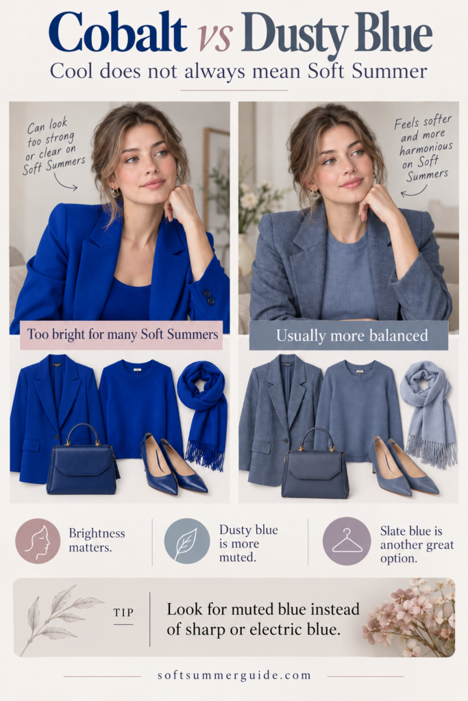
Cobalt blue is cool. Hot fuchsia can be cool. A vivid blue-red can also be cool. Yet all of those colors can still look much stronger and clearer than the Soft Summer palette.
The missing element is mutedness.
When you shop, it therefore helps to ask not only, “Is this color cool?” but also, “Is it soft enough?”
A cobalt sweater, for example, might technically sit on the cool side of the spectrum, but a dusty blue or slate version often blends far more naturally with Soft Summer coloring.
Instead of:
- cobalt blue, try dusty blue or slate
- hot pink, try muted berry
- clear purple, try smoky plum
- bright teal, try a muted blue-green
A useful real-world example is this Amazon Essentials dusty blue sweater. The point is not that this exact sweater is the only “correct” choice, but that the color direction is softer and less saturated than a strong cobalt blue.
Mistake #3: Buying Black Because “Black Goes With Everything”
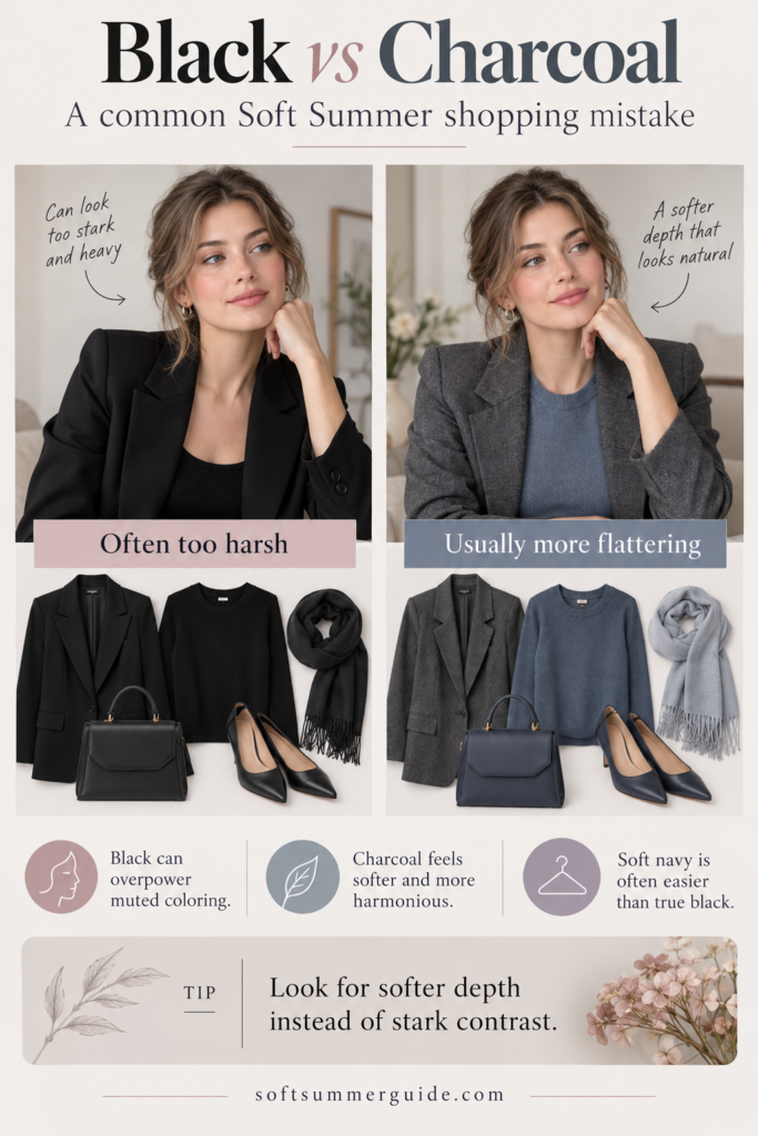
Black is probably one of the most practical Soft Summer dilemmas because it is everywhere. It is easy to combine, widely available and often feels sophisticated, so it is completely understandable that many people continue buying it even after discovering their season.
And there is nothing wrong with that. Soft Summer can absolutely wear black.
The question is simply whether black is the easiest dark neutral for you, especially close to your face.
Some Soft Summers find that black creates a sharper edge than they want, while charcoal, graphite, smoky navy or blue-gray give them almost the same depth with a softer overall effect.
For example, a heather gray cardigan or a gray blazer can often perform the same job as a black basic while integrating more easily into a Soft Summer wardrobe.
If you already own a lot of black, there is no reason to replace everything. You can simply soften it by placing one of your better colors close to your face. Black trousers with a dusty blue sweater, for example, create a completely different effect than a black turtleneck, black coat and black scarf worn together.
Color analysis should help you use your wardrobe better, not force you to start over.
Mistake #4: Buying Bright White as Your Default Basic
Classic wardrobe advice often starts with the same pieces: a white T-shirt, a white button-down, a white knit and white sneakers.
The problem is that “white” is not one single color.
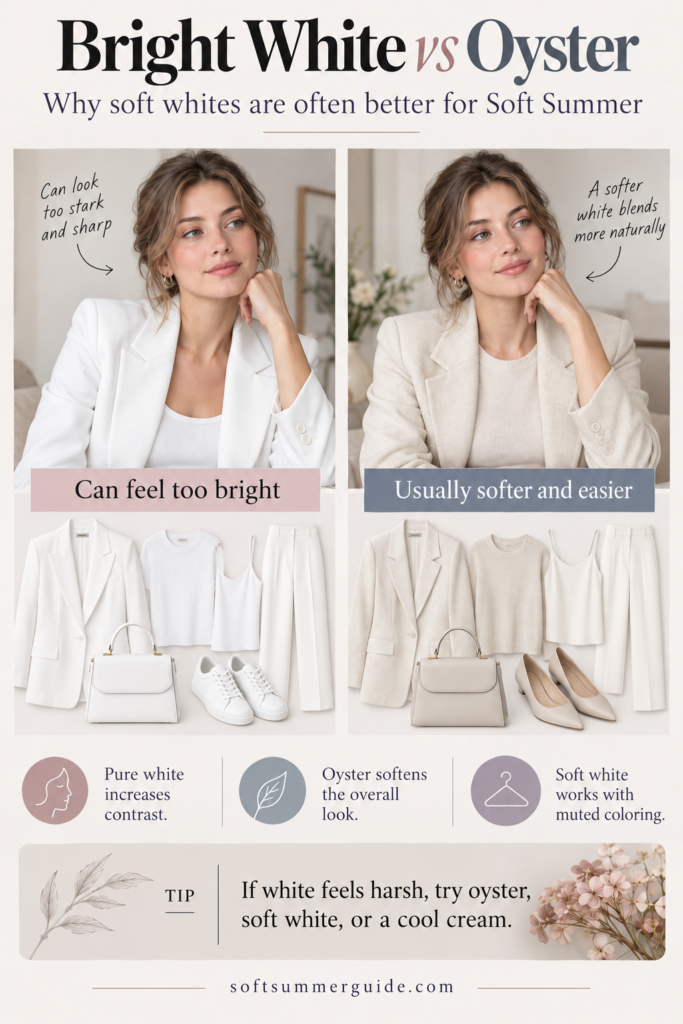
A very crisp optic white creates strong contrast, and while some Soft Summers like that effect, others immediately notice that the white seems to sit separately from their coloring.
If that happens to you, try comparing bright white with softer light neutrals such as:
- oyster
- pearl
- chalk
- soft white
- very pale cool gray
A sweater in a softer oyster direction, such as this oyster knit, still gives you the clean light-neutral effect of white without necessarily looking quite as stark.
If you want to see how those neutrals fit into the wider palette, you can also read my Soft Summer Colors guide.
Mistake #5: Assuming Beige, Camel and Tan Are Automatically Timeless
If you search for capsule wardrobes, timeless style or quiet luxury, sooner or later you will come across camel. Camel coats, camel trousers, camel knitwear and camel bags are often treated as universal wardrobe essentials.
They are not.
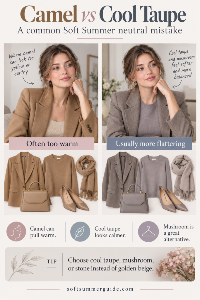
Camel can be a beautiful color, but many camel shades contain a strong golden or orange component. That warmth can be quite noticeable next to Soft Summer coloring.
If you love the elegant, neutral effect of camel but find that it never quite looks right on you, try moving slightly cooler instead.
Look for:
- cool taupe
- mushroom
- greige
- stone
- gray-beige
- rose taupe
A cool taupe knit can give you the same sophisticated, understated effect without adding as much warmth.
A simple trick is to hold the beige or camel item next to something gray. If the supposedly neutral shade suddenly looks very yellow, golden or orange, you have a useful clue about its temperature.
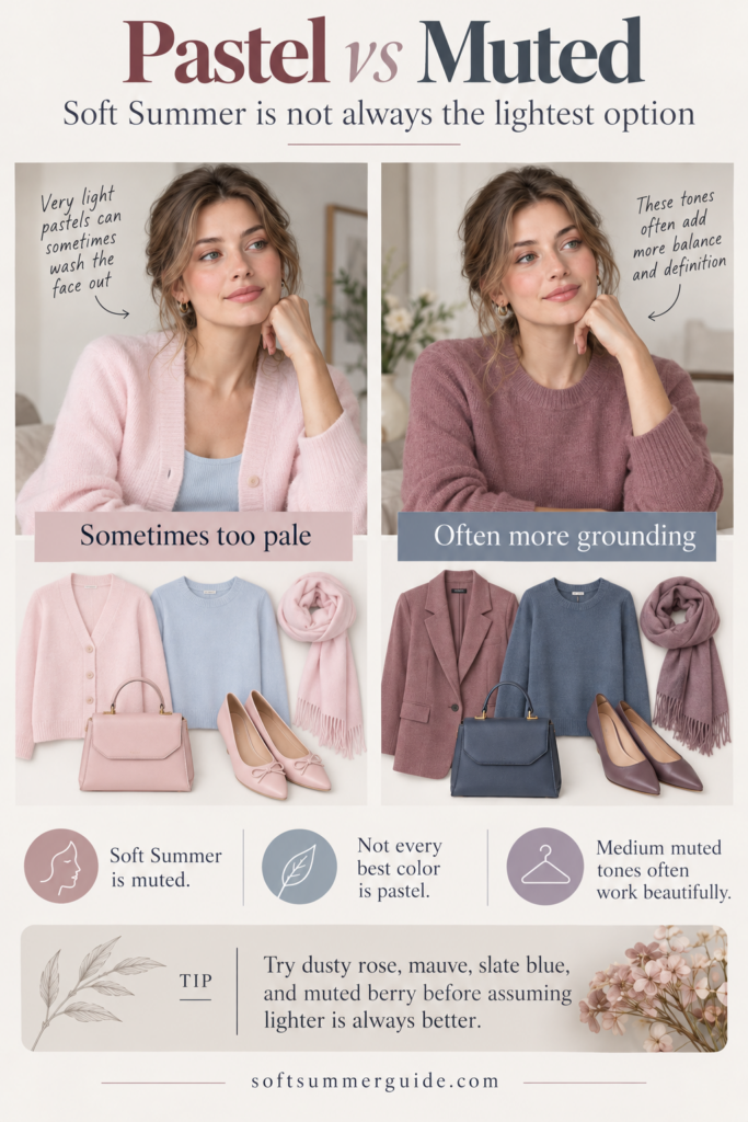
Mistake #6: Buying Every Pastel Because You Are a Summer
The idea that every Summer must look best in pale pastel colors is one of the most persistent misconceptions in seasonal color analysis.
Soft Summer is not defined primarily by lightness. It is defined much more strongly by softness.
That means some Soft Summers look beautiful in pale shades, while others need a little more depth. If baby pink, very pale lavender or powder blue makes you disappear, that does not mean your color analysis is wrong. You may simply need deeper versions of those same color families.
Instead of automatically moving lighter, try:
- dusty rose instead of baby pink
- slate instead of very pale blue
- mauve instead of pastel lavender
- berry instead of candy pink
- soft navy instead of pale blue
In other words, you can move deeper without becoming brighter.
If you are unsure whether your coloring actually needs more lightness, compare the three Summer seasons in my Soft Summer vs True Summer vs Light Summer guide.
Mistake #7: Confusing Muted With Warm
This is particularly common when someone sits close to the Soft Summer and Soft Autumn border.
You see an olive sweater, a muted rust blouse, a camel cardigan or a terracotta dress and think, “It is soft and not very bright, so it should work.”
The problem is that Soft Autumn is muted too.
Mutedness is only one part of the equation. Soft Summer remains cool or cool-neutral, while Soft Autumn moves noticeably warmer.
This is why direct comparison is so helpful. Instead of looking at one color in isolation, compare pairs such as:
- sage vs olive
- rosewood vs terracotta
- cool taupe vs camel
- dusty rose vs muted peach
- slate blue vs warm teal
The difference often becomes much easier to see when the shades sit next to each other.
If these two seasons still feel very similar to you, read my full Soft Summer vs Soft Autumn comparison.

Mistake #8: Buying Colors That Are Too Dark Just Because They Feel Elegant
Once people start avoiding bright colors, another shopping habit sometimes appears: everything becomes very dark.
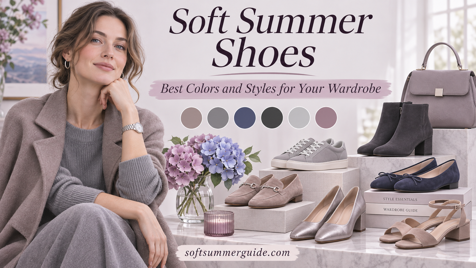
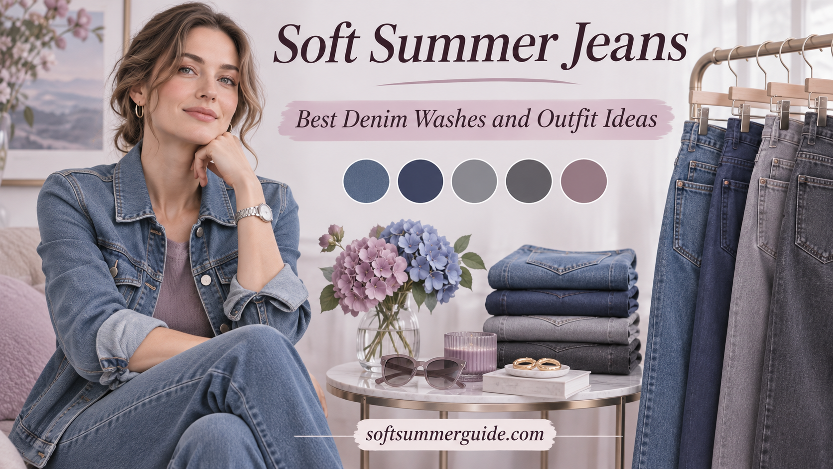
Two especially useful places to apply these shopping rules are choosing flattering jeans and versatile shoes.
Deep navy, dark burgundy, forest green, chocolate and black can all feel safe and sophisticated, but a muted color can still be too heavy.
Soft Summer usually works beautifully around a medium value range, with darker shades used as accents and neutrals rather than automatically becoming the entire wardrobe.
If your darker clothes tend to overpower you, try softening the depth slightly.
For example:
- black → charcoal
- very dark navy → soft navy
- dark burgundy → muted berry
- forest green → smoky teal
- espresso → mushroom or cool cocoa
A soft navy blazer is a great example of how you can still create structure and depth without defaulting to black.
It also combines beautifully with oyster, dusty blue, mauve, cool taupe, gray and medium-wash denim, which makes it a much more useful wardrobe piece than a dark item that only works with one or two colors.
Mistake #9: Ignoring Contrast
Sometimes every individual color in an outfit seems reasonable, yet the complete look still feels too strong.
Often the issue is not the individual colors at all. It is the contrast between them.
An optic white shirt with a very dark navy blazer and black trousers contains no neon colors, but the combination still creates a crisp, high-contrast effect.
Soft Summer often looks more natural when the colors sit a little closer together in depth and intensity.
For example:
oyster + soft navy often feels softer than optic white + black.
Dusty blue + gray is gentler than bright white + cobalt.
And mauve + mushroom often blends more naturally than pale pink + black.
You do not have to dress in one color from head to toe. The goal is simply to notice how much contrast your outfit creates as a whole.
Mistake #10: Choosing Prints by One Good Color
A floral dress contains dusty blue, so it must be a good Soft Summer print, right?
Not necessarily.
If the same print also contains black, orange, mustard, bright white and very strong contrast, that one dusty blue flower does not determine the overall effect.
When evaluating prints, step back and look at the whole fabric.
Pay attention to the background color first, because it often occupies the largest area. Then notice which colors dominate the print and how sharply they contrast with one another.
Soft Summer-friendly prints often have a more blended quality. They may look watercolor-like, faded, softly floral, smoky or tonal rather than extremely crisp and graphic.
This does not mean you cannot wear bold patterns. It simply means that if you want a print that integrates easily into your existing wardrobe, the overall impression matters more than one perfect shade hidden somewhere in the pattern.

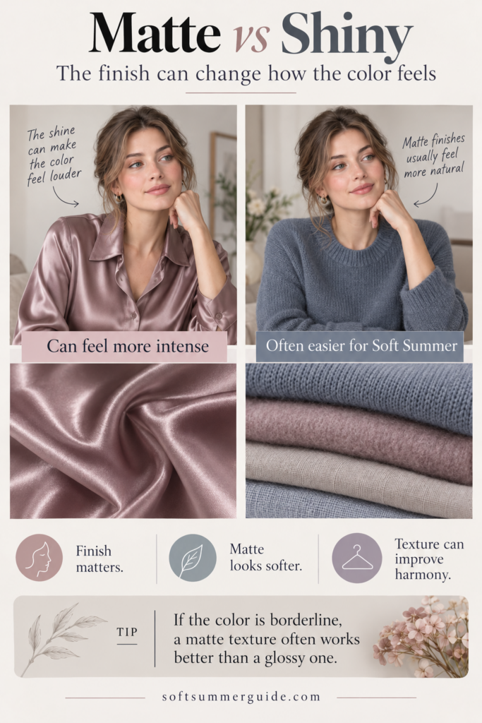
Mistake #11: Ignoring Fabric and Finish
Color does not exist independently from fabric.
Two pieces can be almost the same shade and still look completely different because one is made from brushed wool while the other has a glossy satin finish.
A reflective fabric catches more light, which can make the color appear clearer, brighter and more visually dominant. Matte and softly textured fabrics often reinforce the muted quality that Soft Summer naturally handles well.
Materials that frequently work beautifully with the palette include:
- brushed wool
- knitwear
- suede
- washed denim
- linen
- matte cotton
- jersey
- softly textured leather
This is not a rule against satin, silk or anything shiny. It simply means that fabric finish is another element worth noticing, especially if you sometimes wonder why a “correct” color still feels stronger than expected.
Mistake #12: Buying a Perfect Soft Summer Color That Matches Nothing You Own
This may be the most expensive mistake of all.
You find a beautiful mauve cardigan. The color is muted, the temperature is right and it looks exactly like something from a Soft Summer palette.
So you buy it.
Then you get home and realize that your trousers do not work with it, your jacket does not coordinate and your shoes feel wrong. Suddenly one perfect purchase requires three more purchases before you can actually wear it.
That is how a technically correct Soft Summer color can still become a wardrobe fail.
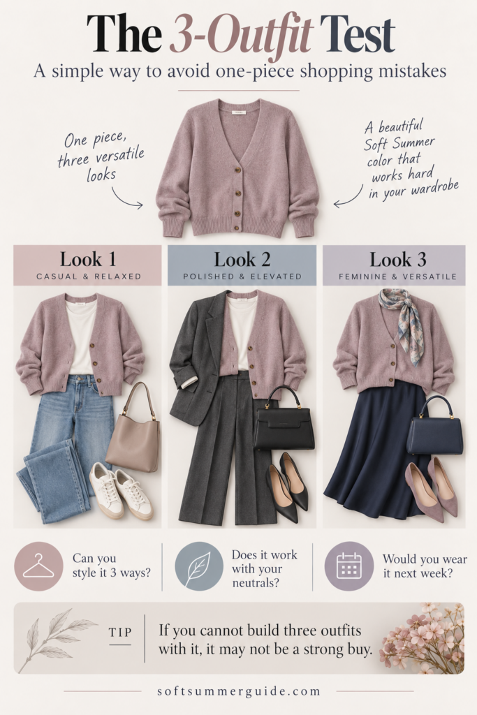
Use the 3-Outfit Test
Before buying something, ask yourself:
Can I create at least three realistic outfits with things I already own?
Imagine, for example, a mauve sweater like this ANRABESS mauve knit.
You might wear it with:
- medium-wash jeans and taupe loafers
- gray trousers and a soft navy blazer
- a soft navy skirt and a gray or taupe coat
Now the item has a clear role in your wardrobe.
A versatile shoe, such as these taupe ankle boots or taupe Skechers, can make those combinations even easier.
The goal is not to build your entire wardrobe around one store or one product. It is to start thinking in terms of systems instead of isolated purchases.
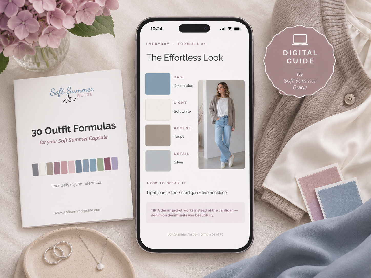
Soft Summer styling mini guide · $11
Buy fewer pieces. Create more outfits.
Before shopping again, see how 30 Soft Summer outfit formulas can help you combine the clothes you already own.
Explore the 30 Outfit FormulasAlready included as a bonus in the complete Closet System.
Bonus Mistake: Judging a Color Only Under Store Lighting
Store lighting can make color decisions surprisingly difficult.
Warm artificial light may make taupe look camel, cool pink look peach, gray look beige or blue appear slightly greener.
Online shopping creates a similar problem because every screen displays colors differently, product photos are edited and studio lighting changes the appearance of fabric.
Whenever possible, look at several photos of the same item, zoom into the fabric, compare it with colors you already understand and check customer photos if they are available.
Once the item arrives, natural daylight is usually the best place to make the final decision.
A product image is a useful starting point, but it is never perfect color truth.
Bonus Mistake: Thinking Every Piece Has to Be Perfect
This is where seasonal color analysis can become unnecessarily restrictive.
Maybe you love a black leather jacket. Maybe your favorite handbag is cognac. Maybe you own a bright patterned dress that makes you happy every time you wear it.
Keep those things.
The goal is not to achieve 100% Soft Summer compliance. The goal is to make shopping easier and reduce the number of purchases that never quite work.
As a general rule, colors worn close to the face tend to have more visual impact, so you may want to be more selective with sweaters, tops, scarves, blazers, coats and dresses than with shoes, handbags, belts, trousers or small accessories.
That alone gives you much more freedom.
The Fastest Soft Summer Shopping Check
Shop Muted Colors to Compare

ANRABESS Women Long Sleeve V Neck Fall Sweater Quarter Zip Pullover | Zip Up Collared Thumb Hole,Lightweight Ribbed Knit Tunic Sweatshirts for Leggings,Work Business Casual Outfits Travel,Clothes
View on Amazon
ANRABESS Sweaters for Women Fall Lightweight Knit Pullover Taupe S | Breathable Soft Stretchy Long Sleeve V Neck Loose Fit Shirts, Business Casual Work Tops, Winter Layering Dressy Blouses
View on Amazon
Stelle Womens Modal Soft T Shirts Short Sleeve V Neck Basic Tee Off-White | Breathable fabric, Loose Fit, Lightweight, Layering essential, Streetwear, Summer Outfits,Fall Tops
View on Amazon
Suede Crescent Crossbody Bag for Women, Hobo Shoulder Purse, Taupe | Soft faux suede with zipper closure, ideal for everyday use, work, travel, and casual outfits
View on Amazon
YSYOKOW Cardigan Sweaters for Women Long Sleeve Open Front, Navy Blue, XL | Long Cardigans for Women Lightweight Soft Casual Dressy Loose Fit Cardigan Sweater with Pockets for Work and Office
View on Amazon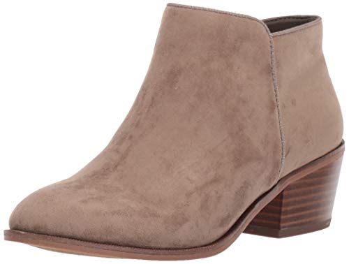
Amazon Essentials Women's Low Heel Ankle Boots with Side Zipper, Stacked Block Heel, Taupe, 8
View on Amazon
Fisoew Womens Sweatshirt Blazer Open Front Lapel Suit Jacket Casual Coat | Long Sleeve, Stand Collar, Notch Lapel, Cotton, Business Overcoat, Work, Office, Fall Winter Outerwear, Treach Coat, Pockets
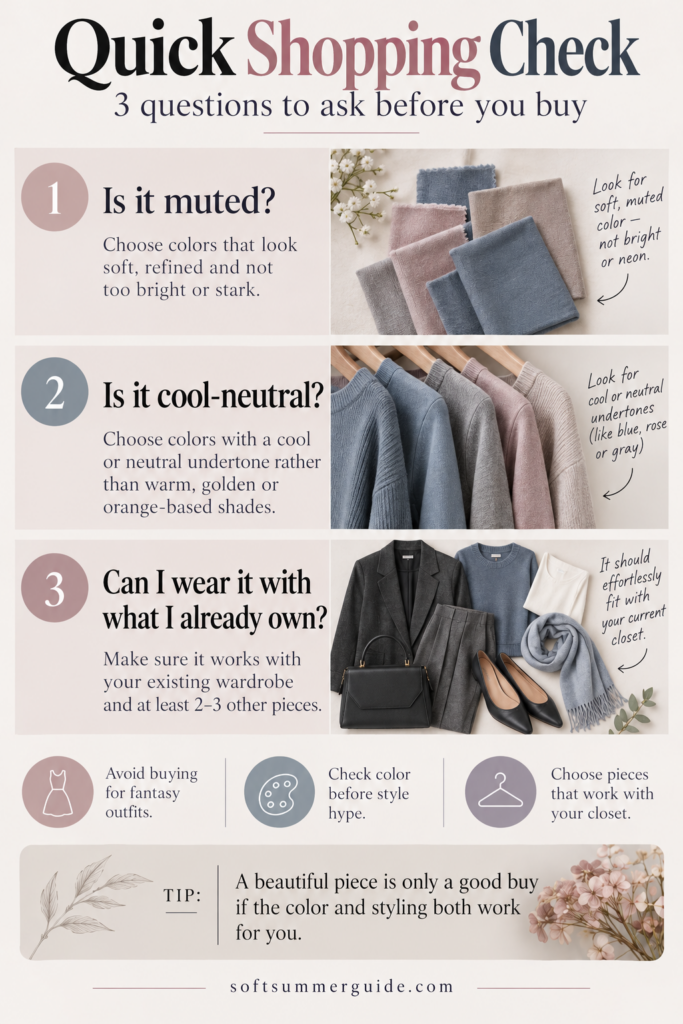
View on AmazonIf you are standing in a store and do not want to analyze color theory for ten minutes, reduce the decision to three questions.
First, ask whether the color is muted. Does it look dusty, smoky, softened or slightly gray rather than bright and clear?
Then check the temperature. Does it lean more toward rose than orange, taupe than camel, sage than olive or slate than warm teal?
Finally, ask whether it works with what you already own.
If the answer to all three questions is yes, you are probably moving in a very useful direction.
Take it shopping with you
Get the free Soft Summer Shopping Guide
A practical reference to help you recognize Soft Summer colors, avoid common shopping mistakes and make more confident choices online or in stores.
Get the Free Shopping Guide →Soft Summer Colors to Avoid — or Better: Colors to Compare
I do not particularly like turning seasonal color analysis into a giant list of forbidden colors. It is much more useful to understand which alternatives are worth comparing.
| Instead of automatically buying… | Compare it with… |
|---|---|
| Black | Charcoal or soft navy |
| Optic white | Oyster or soft white |
| Camel | Cool taupe or mushroom |
| Peach | Dusty rose |
| Terracotta | Rosewood |
| Olive | Sage |
| Cobalt | Dusty blue or slate |
| Hot pink | Muted berry |
| Bright purple | Smoky plum |
| Forest green | Muted teal |
| Golden beige | Greige |
| Deep burgundy | Softer berry or muted wine |
The point is not to prove that one shade is bad and another is good. The comparison simply helps you see which version creates a more balanced relationship with your face and the rest of your wardrobe.
Build a Wardrobe, Not a Collection of Perfect Colors
This is one of the most important parts of Soft Summer shopping.
The goal is not to own one perfect dusty rose sweater, one perfect sage blouse, one perfect blue-gray coat and one perfect mauve skirt if none of those pieces actually work together.
The goal is to build a wardrobe.
A practical Soft Summer wardrobe might begin with a relatively small group of neutrals and accent colors.
For light neutrals, you might use oyster, soft white and pale gray. Medium neutrals could include mushroom, cool taupe, blue-gray and heather gray, while charcoal, graphite and soft navy give you deeper options.
Then you can add a few accent colors such as dusty blue, mauve, dusty rose, sage, berry or muted plum.
Because those shades share a similar level of softness, combining them becomes much easier.
That is also one reason why the Soft Summer palette lends itself so well to a capsule wardrobe.
A Few Useful Soft Summer Wardrobe Examples
If you want to see what these color directions can look like in actual clothing, here are a few examples from the product pool I use when researching Soft Summer shopping options:
Oyster:
Oyster Sweater →
Heather Gray:
Heather Gray Cardigan →
Dusty Blue:
Amazon Essentials Dusty Blue Sweater →
Mauve:
ANRABESS Mauve Knit →
Cool Taupe:
ANRABESS Taupe Knit →
Soft Navy:
Soft Navy Blazer →
Taupe Shoes:
Taupe Ankle Boots →
Again, these are not the only “correct” Soft Summer products. They are simply useful examples of the color families we are talking about.
Want to Browse Actual Soft Summer Colors?
If you prefer browsing by color, I have also created a dedicated shopping page with practical starting points for clothing, shoes, bags and beauty:
There you can browse color directions such as Soft White, Heather Gray, Cool Taupe, Mushroom, Soft Navy, Slate Blue, Dusty Blue, Dusty Rose, Mauve and Sage Green.
Because product photography and dye lots can vary, I still recommend treating every result as a starting point rather than an automatic guarantee.
Frequently Asked Questions About Soft Summer Shopping
What colors should Soft Summer avoid?
I prefer thinking in terms of colors to compare rather than strict colors to avoid. Very warm, highly saturated or extremely high-contrast shades may be more difficult, so you might want to compare black with charcoal, camel with cool taupe, hot pink with berry or cobalt with dusty blue.
Can Soft Summer wear black?
Yes. If black feels harsh near your face, compare it with charcoal, graphite or soft navy. You can also keep black farther from your face and use softer colors in tops, scarves or jackets.
Can Soft Summer wear white?
Absolutely. If optic white creates too much contrast, softer alternatives such as oyster, pearl, soft white or pale cool gray may feel more natural.
Is beige good for Soft Summer?
It can be. Look for cooler or more neutral beige shades such as greige, mushroom, stone and taupe. Very yellow, golden or camel-like beige may lean closer to Soft Autumn.
Can Soft Summer wear bright colors?
Of course, but very saturated colors may become visually dominant. If that happens, compare the bright shade with a more muted version from the same color family.
Does Soft Summer have to wear pastels?
No. Soft Summer is primarily about softness, not extreme lightness. Medium-depth shades and darker muted colors such as soft navy, charcoal, berry and muted plum can be very useful.
What are the best neutrals for Soft Summer?
Some of the easiest starting points are charcoal, graphite, soft navy, cool taupe, mushroom, greige, blue-gray, oyster and soft white.
What should I look for when shopping for Soft Summer clothes?
Start by checking whether the color is muted and cool to cool-neutral. Then look at the overall contrast and, just as importantly, whether the piece actually works with the wardrobe you already own.
Is Soft Summer the same as Soft Autumn?
No. Both palettes are muted, which creates plenty of overlap, but Soft Summer leans cool-neutral while Soft Autumn leans warm-neutral. You can see the difference in my Soft Summer vs Soft Autumn guide.
Why do Soft Summer colors often look gray?
That slight grayness is simply lower saturation. It is what turns hot pink into dusty rose, cobalt into slate and a vivid purple into a softer mauve or plum.
How do I build a Soft Summer capsule wardrobe?
Start with a small neutral base such as soft navy, charcoal, cool taupe, oyster and gray. Then add a few muted accent colors like dusty blue, mauve, sage and berry. A smaller color system often gives you far more outfit combinations than a wardrobe full of unrelated “perfect” colors.
The Soft Summer Shopping Rule I Use Most
If I had to reduce the entire article to one idea, it would be this:
Do not shop for the perfect color name. Shop for the right effect.
A color does not need to be called “Soft Summer Blue,” and it does not have to match one exact digital swatch or hex code. What matters is whether it behaves like your palette: softer rather than brighter, cool-neutral rather than strongly warm, and harmonious rather than overpowering.
Then ask yourself one final question before buying:
Will I actually wear it?
Because the best Soft Summer purchase is not the one that follows the most rules. It is the one that fits naturally into your wardrobe and makes getting dressed easier.
Stop guessing at the rack
Keep your Soft Summer colors close
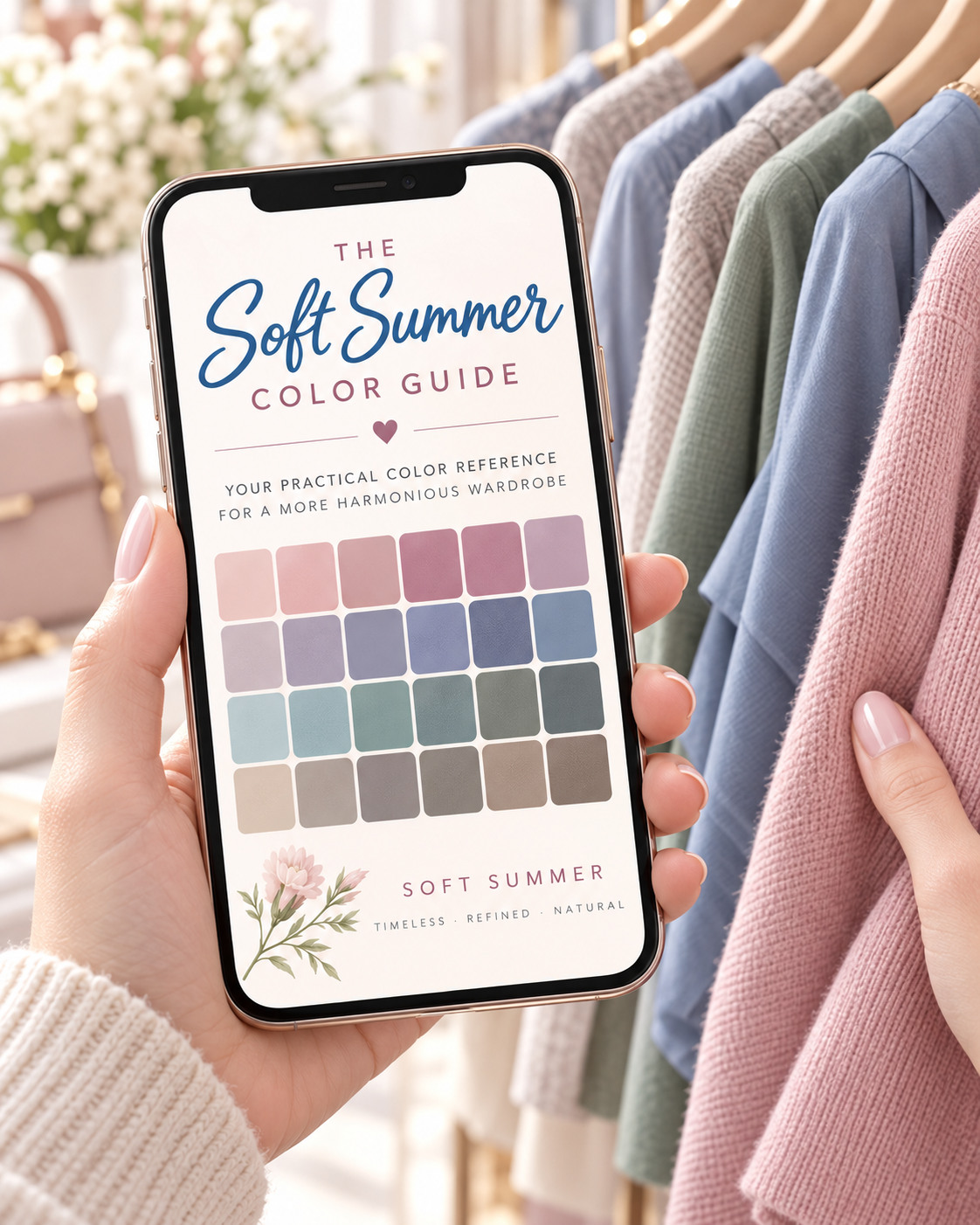
The 49-page Soft Summer Color Guide gives you a detailed visual reference for neutrals, accent colors, darker shades and combinations so you can recognize the right direction more easily while shopping.
Explore the Color Guide · $19 →If your shopping mistakes come from not knowing what works together, the Soft Summer Closet System waitlist is a useful next step. It focuses on building a wardrobe around the clothes you already own.
0 Comments